The Top Brand Logo Trends in 2017
For logo design, 2016 was a year of simplicity, bright colours, sans-serif, circles and more. Some of these styles have crossed over to 2017 with a few changes here and there. This year, designers seem to be going back in time for design inspiration, giving a modern twist to older styles. We’ve made a selection of brand logo trends already shaping 2017.
Minimalism and Simplified Forms
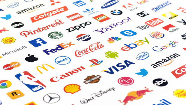
Minimalism has been in the spotlight for a long time and it’s set to be even bigger this year. We see it in the way text, shapes, and colours are applied and combined. For instance, consider the MasterCard logo that had its busier, heavier elements dropped for a cleaner, simpler look. The text is now all lower case and beneath the circles, while the red and yellow circles aren’t interlocked anymore, but now overlap to produce an orange section.
Apart from the modern look, there’s a more deliberate reason why brands will continue to make similar changes to their logos. With the exponential growth of the digital world, cleaner designs will help companies in cross-device and cross-channel branding.
Ombré and Gradients
We know gradients to be about bold and bright colours that add depth and volume, however, we’re starting to see simplification being applied to gradients with designers leaning towards muted hues. Overlapping gradients like what we see in MasterCard’s redesigned logo are a fairly new technique but will likely gain ground this year, same goes for ombré.

Hand-drawn
Used especially in the food and drink industry. Hand-drawn designs emanate warmth and personality. They have a unique authenticity that can’t quite be captured in digital designs. Popular in 2016, we expect to see more hand-drawn designs this year.
Negative Space
This technique involves the use of a positive and negative space that each compete for attention. Logos designed with negative space are engaging because they pose a challenge to the viewer, seem to have a deeper meaning and are memorable.
Moving Parts
This trend is one of those inspired by the expanding digital space. Interactive logos with moving parts and dancing colours are set to be popular this year. These web-based animated GIFs draw in the viewer, creating a highly engaging experience with the logo.
Vintage and Cartoon-Style Logos
In this article on Design Hill’s blog, Janus Jarapa suggests designers “take inspiration from the years past.” In 2017, we’re set to see cartoon-style lettering from the 70s and 80s make a comeback, with a modern twist of course. Vintage logos have a “blast from the past” feel that can be combined with modern design elements to create a sense of connectivity when used appropriately.
Line Art
This fun, modern technique emerged fully in 2015 and hasn’t slowed down since. It uses lines of a uniform thickness and simplified colour palettes to create laid-back, minimalist designs. We see the manifestation of this technique in logos with never-ending loops and one-line designs.

Related Posts
Preparing images for web: The SEO way →

Is Content Writing Really About Content? How to Spot the Professionals →
Voice Search Content Delivery From Mockey To Orkney →